")

Color isn’t decoration. On a billboard, it’s a split-second decision-maker — and it either works or it doesn’t.
Drivers and pedestrians process outdoor ads in roughly 1.5 to 3 seconds. In that window, your color choices are doing most of the heavy lifting. Before anyone reads a word of copy or registers your logo, their brain has already made a snap judgment about whether the board is worth a second glance. That judgment is largely driven by color.
So what actually works? Let’s dig into the research, the psychology, and some real-world lessons from OOH design — and give your next campaign a fighting chance.
Color Psychology in Out-of-Home Advertising
Color psychology isn’t new, but its application to outdoor advertising is more nuanced than most people realize. It’s not just about which colors “feel right” for a brand — it’s about how specific hues communicate urgency, trust, appetite, or calm before the conscious mind even gets involved.
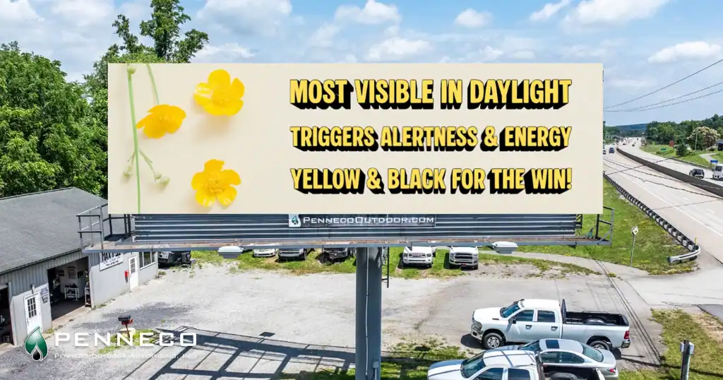
Yellow consistently ranks as the most visible color to the human eye in daylight conditions. It triggers alertness and energy, which is exactly why it dominates warning signage. In billboard design, yellow paired with a dark contrasting color — particularly black — creates one of the highest-visibility combinations available. McDonald’s didn’t land on those golden arches by accident.

Red activates urgency and excitement. It’s physiologically stimulating, which is why it works so well for limited-time offers, sales, and fast-casual food brands. Studies in environmental color psychology show that red increases heart rate slightly — which translates, in OOH terms, to attention. The catch? Red on red, or red with other warm tones, bleeds together fast and loses impact.
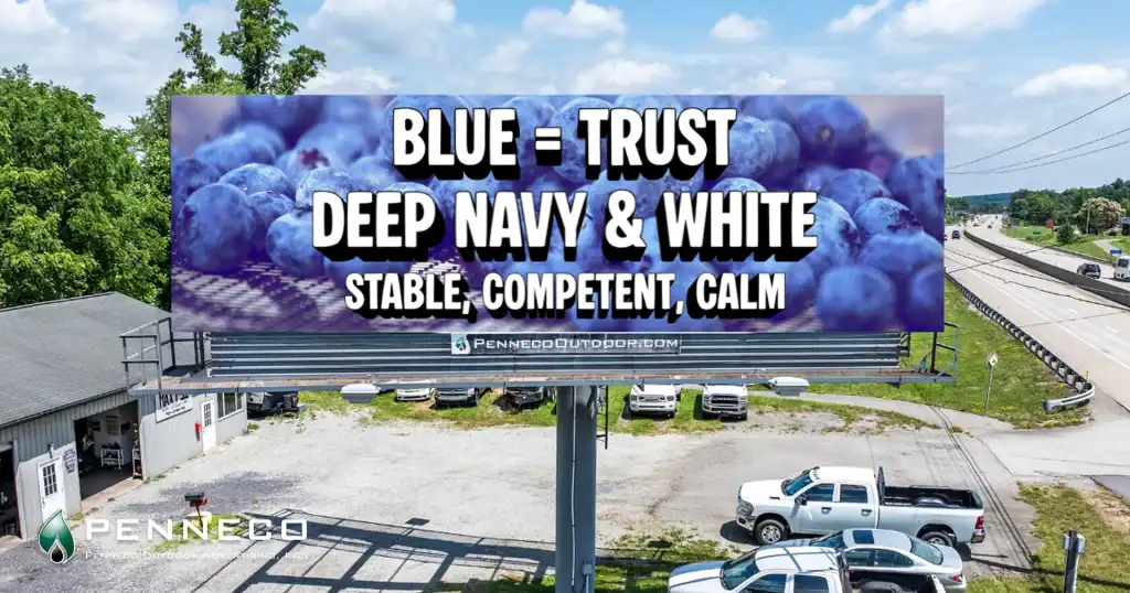
Blue is the trust color. Banks, healthcare providers, and tech brands lean on it for good reason — it reads as stable, competent, and calm. On a billboard, lighter blues can struggle with sky backgrounds (more on that shortly), but deep navy with white text is one of the cleanest high-recall combinations in outdoor advertising.
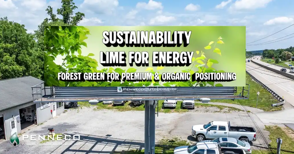
Green has expanded beyond its traditional association with nature and health. As sustainability messaging becomes central to more brand identities, green is getting used with more sophistication — bright lime greens for energy and disruption, deeper forest greens for premium and organic positioning. Either way, green has strong visibility against urban gray environments.
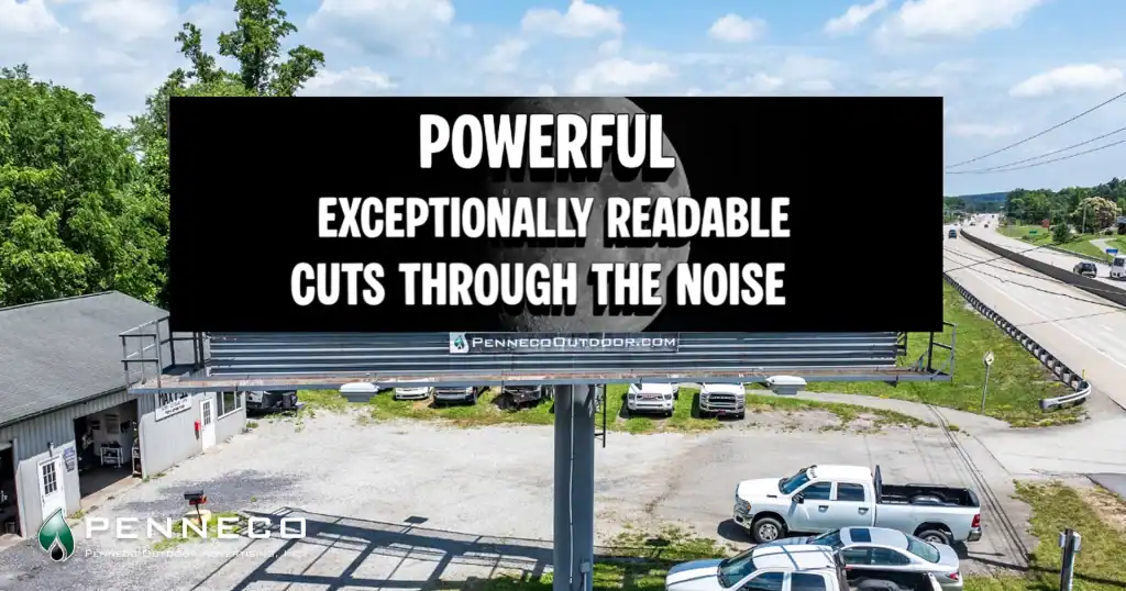
Black and white remain perennially powerful. They’re not exciting, but they’re exceptionally readable, and when the rest of a visual environment is noisy and colorful, a stark black-and-white board can cut through precisely because it does the opposite of everything else out there.
One important caveat: color meaning isn’t universal. If your campaign runs in international markets, or in communities where color symbolism differs significantly from mainstream Western associations, cultural context matters. A white billboard background reads as clean and minimal in North America — in some other contexts, it carries different connotations entirely. Know your audience before locking in a palette.
Contrast and Readability Best Practices
If color psychology is the theory, contrast is the practice — and it’s where most billboard design decisions either succeed or fail.
The core principle is simple: the greater the difference in luminance (light vs. dark) between your text and your background, the more readable your message becomes at a distance and in motion. But applying that principle well takes some thought.
The most legible color combinations for billboard advertising, according to visibility studies from the Out of Home Advertising Association and highway design research, consistently include: black on yellow, black on white, yellow on black, white on blue, and white on green. These aren’t arbitrary — they’re the combinations that hold up under varied lighting conditions, at highway speeds, and from oblique angles.
What kills readability faster than almost anything else is insufficient contrast between similar values. Dark blue text on a black background. Red type on an orange field. Medium gray on white. These combinations look fine on a monitor at your desk but fall apart completely at 65 miles per hour from 200 feet away.
Background-environment conflict is an underappreciated issue. A bright blue billboard placed where sky is the primary backdrop behind the structure creates visual noise — the board and the background compete. The same applies to green boards near heavy tree lines. If you know the physical location of your placement, factor in what’s behind the structure when selecting your palette.
Color count matters too. The most effective billboards typically use two to three colors, maximum. Every additional color you introduce creates more visual complexity for the brain to process — and you simply don’t have enough time to earn that processing. High-impact boards are almost always reductive: a dominant background, a sharp accent, and a neutral (usually white or black) for text.
Digital billboard (DOOH) formats add another layer to consider. Screen brightness varies by time of day and ambient light conditions, and colors that pop on a backlit display in the evening may look washed out in direct afternoon sun. If you’re designing for digital OOH placements, work with your media partner to understand the specific screen specs and test your designs in simulated daylight and nighttime conditions.
Font weight interacts with color contrast. A thin typeface in a light color on a medium background is a recipe for illegibility. If your brand font is lightweight or condensed, compensate by increasing contrast significantly — push the background darker or lighter than you think you need to. Heavier typefaces (bold, black weights) are inherently more forgiving with moderate contrast because there’s more ink on the board.
Real-World Examples That Prove the Point
Theory is useful. But what does this actually look like when it works — and when it doesn’t?
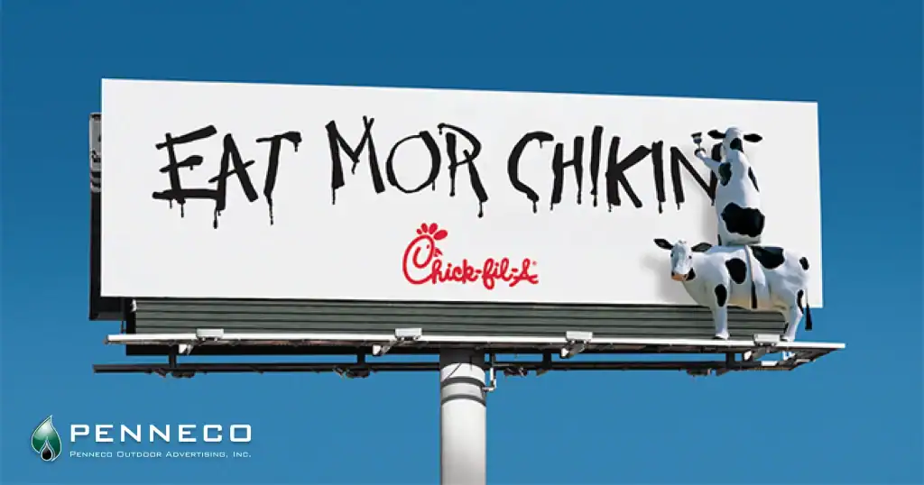
The Chick-fil-A cow campaign is one of the most cited examples of effective billboard design in the OOH industry, and color is a big reason why. The bold red logo with black text and a black and white cows creates extreme contrast, emotional warmth, and strong brand recall. It’s simple, it’s loud, and it’s consistent. After decades of the same palette, that red-and-white combination has become almost synonymous with the brand in the markets where it runs.
Apple’s outdoor advertising takes the opposite approach — white or black backgrounds, product imagery, minimal copy. The contrast is extreme in value terms, even if the palette is quiet. What Apple understood early is that restraint, when executed with precision, stands out in environments where every other advertiser is trying to be the loudest. Color works through contrast with the surrounding environment, not just within the board itself.
Cautionary examples are everywhere too. Billboards with four or five brand colors, photographic backgrounds with text overlaid directly on busy imagery, gradient backgrounds that shift from medium to medium — these are the designs that people drive past without retaining a single element. Not because the brand isn’t good, but because the color and contrast decisions didn’t respect the format.
One regional healthcare campaign that Penneco’s design team reviewed recently had a soft teal-to-blue gradient with white text — a palette that looked polished in a branding deck but was nearly unreadable in the field. A straightforward swap to deep navy with white text and a single accent color transformed the board’s visibility without touching the core brand identity. Small adjustments, significant impact.
Putting It All Together
The best colors for billboard advertising aren’t necessarily your favorite colors, your brand’s hero colors, or the trend palette your design team is excited about right now. They’re the colors that communicate your message clearly, at speed, from a distance, in the conditions where your board actually lives.
Start with contrast. Push it further than feels comfortable on screen. Limit your palette. Consider the physical environment. And if you’re uncertain whether a design is going to hold up in the real world, test it — reduce it to a small thumbnail, squint at it, view it from across the room. If it’s still readable and recognizable, it’s probably going to work on a board.
Color is where great billboard design begins — and where mediocre billboard design ends. Getting it right is one of the highest-leverage decisions in your entire OOH campaign.Ready to put these principles to work on your next campaign? Penneco Outdoor Advertising’s design and creative services team helps brands translate strategy into high-visibility outdoor executions — from concept through production. Let’s build something worth seeing.