")

Using billboard advertising as part of your business’ marketing strategy? That’s great! With 96% of Americans exposed to billboards and 71% of us ‘often’ looking at them, it’s a smart way to build your brand and advertise your business. But creating the design for a billboard can be overwhelming. It doesn’t have to be though. Read on to get 5 of our designers’ favorite tips to design a billboard that grabs attention and leaves a lasting impression — long after viewers drive by.
TIPS TO DESIGN A BILLBOARD
KEEP IT SIMPLE
The average traveler has less than ten seconds to read your billboard. Make sure to keep your message simple, direct, and clear. If at all possible, use less than 6 words.

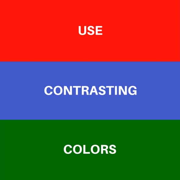
USE CONTRASTING COLORS
When designing a billboard ad, make sure you choose bold, high contrast colors. Not only does this greatly improve readability, it also ensures your ad stands out from the surrounding landscape.
CHOOSE A LEGIBLE FONT
Be sure you use typefaces that are easy to read from a distance of at least 1000 feet. Avoid using thin fonts, bulky lettering, and fancy script. Serif fonts are often the best choice.

USE LARGE LETTERING
Your outdoor ad’s line height needs to be large – at least two feet. However three feet and higher is best. Additionally, provide ample space between letters to make sure words don’t merge together.

MAKE IT VISUAL
Remember that outdoor advertising visually tells a part of your company’s story. Make it vivid and memorable with relevant, high-quality images that evoke emotion.
